Pay by Bank
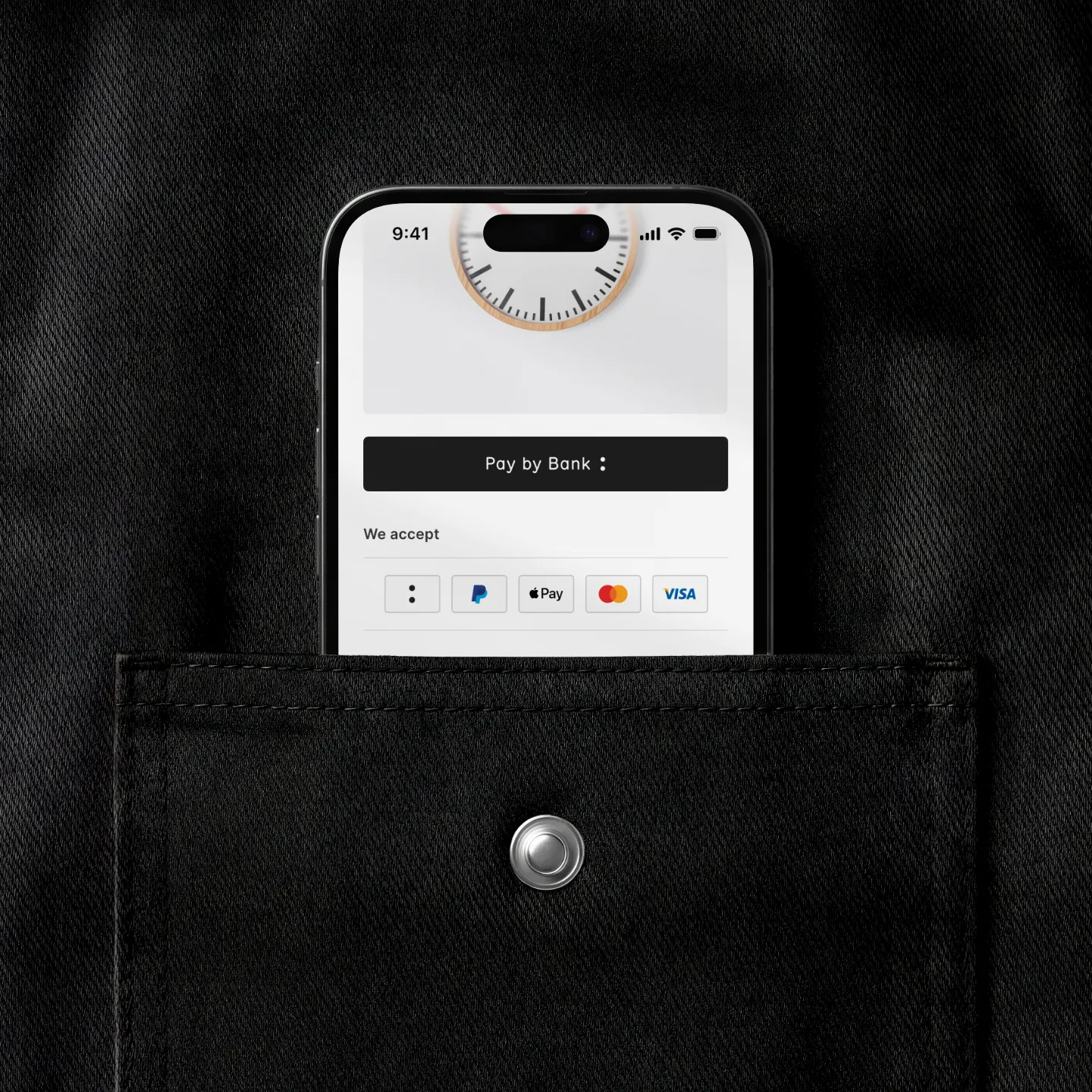
Pay by Bank is Banked’s payment button, made to sit beside Apple Pay in merchant checkouts. I built it as one React codebase that ships to web apps, native mobile, and the open web.
- Role
- Engineering Lead
- Scope
- Components, demos & docs
- Platforms
- Web, iOS & Android
- Stakeholders
- CTO & CMO
Pay by Bank is the payment button Banked’s merchants place alongside Apple Pay, Google Pay, and PayPal in their checkout flows. I built it solo — one React codebase compiling to web apps, native mobile, and framework-free Web Components for any plain HTML site.
With Banked’s lead designer, I helped formalise the design system tokens behind the button, a set that rolled out across their broader product ecosystem. Around the button sit a working demo store, step-by-step integration guides, and a generator that lets anyone on a merchant’s team pick from the 106 variations of the core components and copy out a ready-to-paste snippet. The front-end install is two lines of code, and Bank of America went on to launch Pay by Bank for its own merchants.
Banked lets merchants accept bank transfers instead of card payments, cutting transaction fees by up to 96%.
After the marketing site launched, Banked brought me back to build Pay by Bank — the button merchants would put alongside Apple Pay, Google Pay, and PayPal in their checkout flows. It needed to look like it belonged there, install in minutes, and adapt to whatever payment surface it dropped into.
Technology
Apple Pay and Google Pay both ship as Web Components — open web standards, drop-in install, self-contained so they don’t tangle with the merchant’s own code. Banked’s checkout embeds already used Web Components, which made the choice obvious.
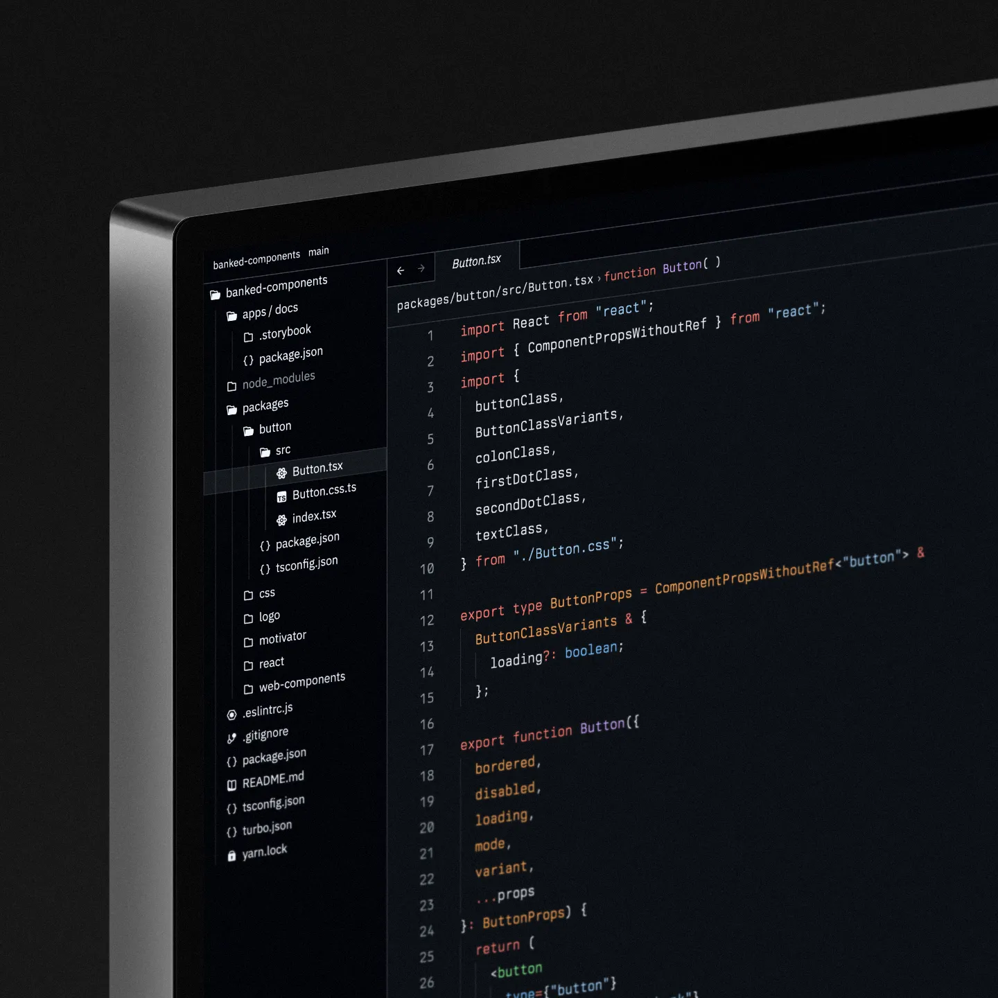
I built the button in React with a styling engine that compiled the same source to three targets. React served the web and native mobile apps, and lightweight Web Components, via Preact, covered any site not built on React.
One codebase, three integration paths at launch, and no forks or complex multi-repository setups to maintain.
The design ran in parallel. Working with Francis O Donnell Smith, Banked’s lead designer, I helped formalise a series of design system tokens. This was used first on the button itself and later adopted across the rest of Banked’s products.
Guidelines
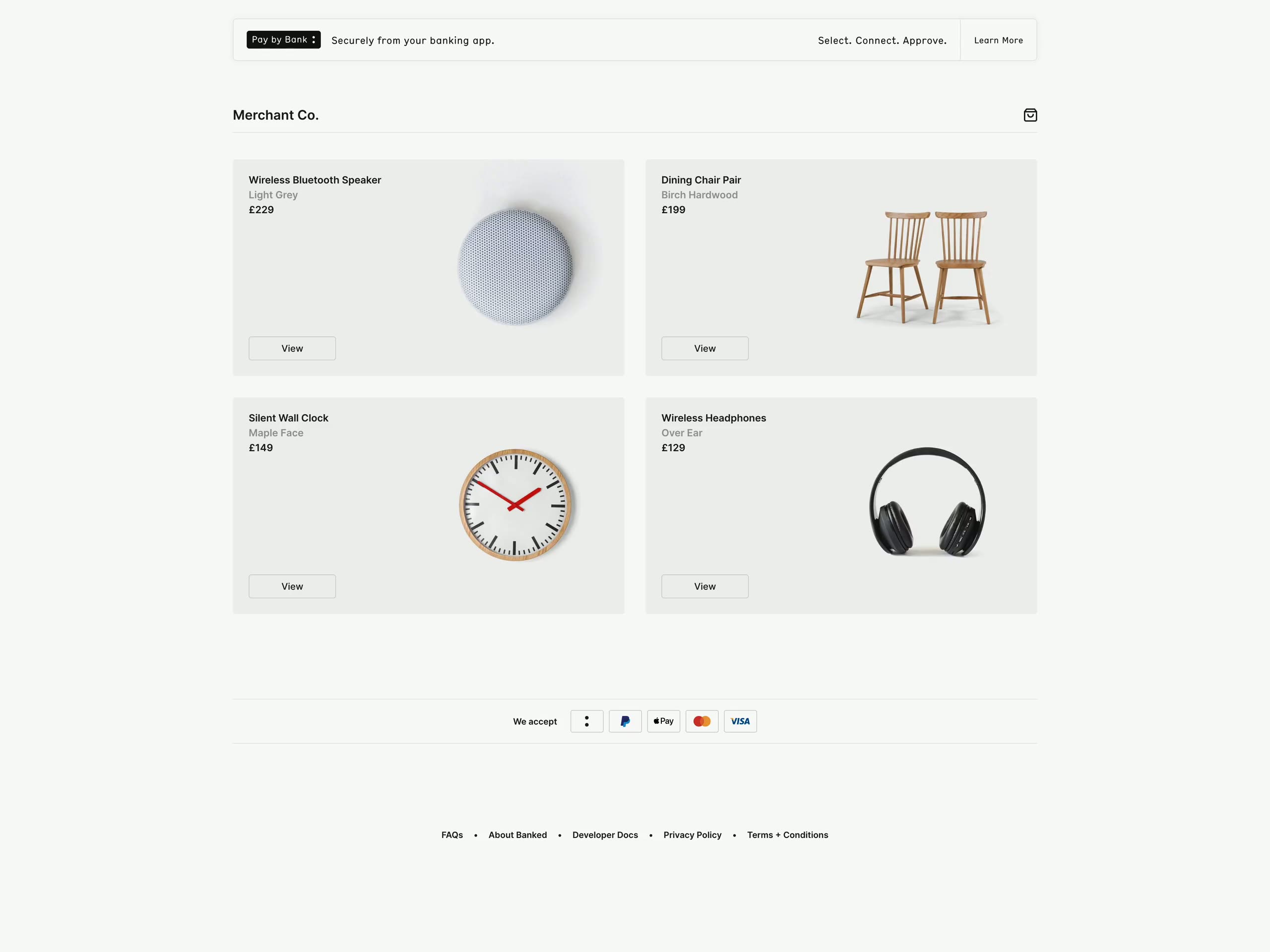
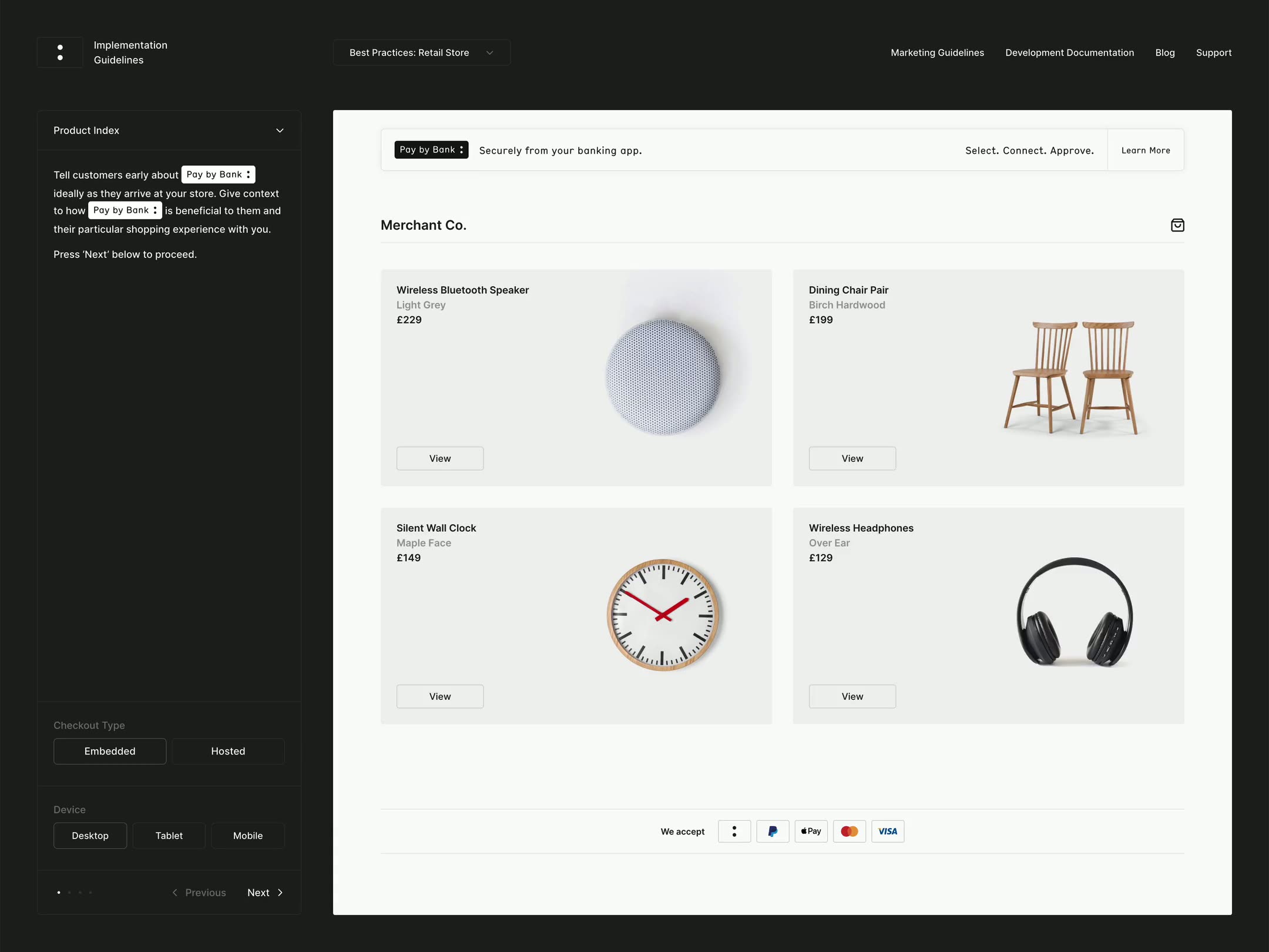
A button component library on its own isn’t enough. Merchants need to see it working in context and have documentation on integration. I built an e-commerce demo store that showed the different integration approaches, each with its own shareable link so the sales teams could send a merchant straight to the variant relevant to them.
I wrapped a guideline site around the demo store, walking through the checkout step by step. As the user moved through the flow, the page overlaid the implementation notes for that moment. Merchants could then see how the button behaved in a real checkout flow and read the integration detail exactly where it applied.
Generator
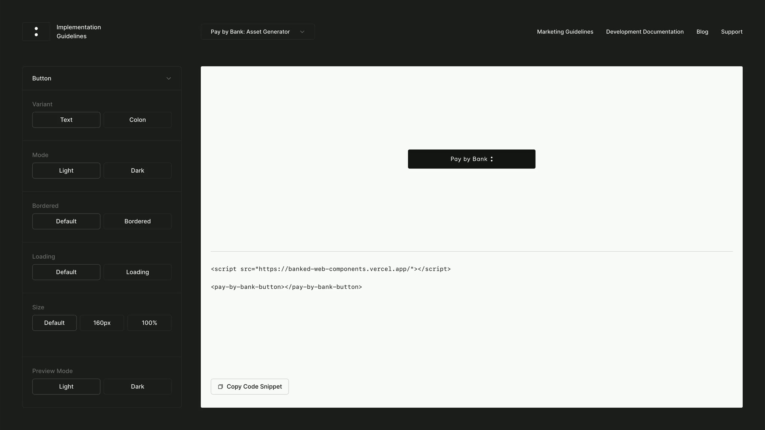
I also added an interactive asset generator. Merchants can pick from the 106 possible variations of the core components, watch the button update in real time as they tweak appearance and state for their specific use case, and then copy a code snippet ready to paste directly into their site.
The snippet itself is self-documenting. Every component property is named in the generated markup, so the developer pulling it in can read exactly what the button supports without having to refer back to the documentation.

Impact
The button and its supporting platform made adoption low-effort. It sits in checkout flows next to Apple Pay and PayPal, adapting to different surfaces and brand design systems.
The work I delivered here also outgrew the brief. The design tokens formalised for the button were later used across Banked’s product line, and the project sat alongside the Red Nose Day donation page and merchant microsites in a partnership that started with the marketing website.
More case studies
The campaign that changed equity law across Europe, and the website that started the Banked partnership.